
Python:Matplotlib 和 Seaborn 练习测试 (二十六)
在此类工作区中,你将能够练习在课程中学到的可视化技巧。在此工作区中,你将练习为分类数据创建单变量图形。
# prerequisite package imports
import numpy as np
import pandas as pd
import matplotlib.pyplot as plt
import seaborn as sb

%matplotlib inline

# solution script imports
from solutions_univ import bar_chart_solution_1, bar_chart_solution_2
在此工作区中,你要处理的数据集由视频系列游戏 Pokémon 中的角色属性组成。该数据来自此 GitHub 代码库中的信息数据库。
pokemon = pd.read_csv('./data/pokemon.csv')
pokemon.head()| id | species | generation_id | height | weight | base_experience | type_1 | type_2 | hp | attack | defense | speed | special-attack | special-defense | |
|---|---|---|---|---|---|---|---|---|---|---|---|---|---|---|
| 0 | 1 | bulbasaur | 1 | 0.7 | 6.9 | 64 | grass | poison | 45 | 49 | 49 | 45 | 65 | 65 |
| 1 | 2 | ivysaur | 1 | 1.0 | 13.0 | 142 | grass | poison | 60 | 62 | 63 | 60 | 80 | 80 |
| 2 | 3 | venusaur | 1 | 2.0 | 100.0 | 236 | grass | poison | 80 | 82 | 83 | 80 | 100 | 100 |
| 3 | 4 | charmander | 1 | 0.6 | 8.5 | 62 | fire | NaN | 39 | 52 | 43 | 65 | 60 | 50 |
| 4 | 5 | charmeleon | 1 | 1.1 | 19.0 | 142 | fire | NaN | 58 | 64 | 58 | 80 | 80 | 65 |
任务 1:该系列游戏出了很多种神奇宝贝。每一代推出了多少种神奇宝贝?请根据 'generation_id' 列绘制出频率条形图。
# YOUR CODE HERE
base_color = sb.color_palette()[0]
sb.countplot(data = pokemon, x = 'generation_id', color = base_color)
<matplotlib.axes._subplots.AxesSubplot at 0x7f51fb5935f8>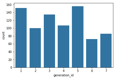
创建好图表后,运行以下单元格以检查我们的解决方案的输出。你的可视化图表并非必须和我们的一样,但是应该能够得出相同的结论。
bar_chart_solution_1()I used seaborn's countplot function to generate this chart. I also added an additional argument so that each bar has the same color.
任务 2:每种神奇宝贝都具有一到两种在进攻和防御时起到作用的'属性' 。每种属性的频率是多少?以下代码创建了一个新的 DataFrame,该 DataFrame 将所有属性计数放入了一个列中。
pkmn_types = pokemon.melt(id_vars = ['id','species'],
                          value_vars = ['type_1', 'type_2'],
                          var_name = 'type_level', value_name = 'type').dropna()
pkmn_types.head()| id | species | type_level | type | |
|---|---|---|---|---|
| 0 | 1 | bulbasaur | type_1 | grass |
| 1 | 2 | ivysaur | type_1 | grass |
| 2 | 3 | venusaur | type_1 | grass |
| 3 | 4 | charmander | type_1 | fire |
| 4 | 5 | charmeleon | type_1 | fire |
你的任务是使用此 DataFrame 创建一个神奇宝贝与每种属性的比例_相对频率_图形,按频率从高到底排序。提示:长条之和应该大于 100%,因为很多神奇宝贝具有两种属性。在使用分母计算相对频率时请注意这一点。
# YOUR CODE HERE 相对频率
n_points = pkmn_types.shape[0]
max_count = pkmn_types['type'].value_counts().max()
max_prop = max_count / n_points

# generate tick mark locations and names
tick_props = np.arange(0, max_prop, 0.05)
tick_names = ['{:0.2f}'.format(v) for v in tick_props]

# create the plot
base_color = sb.color_palette()[0]
sb.countplot(data = pkmn_types, y = 'type',  order = pkmn_types['type'].value_counts(sort = True).index, color = base_color)
plt.xticks(tick_props * n_points, tick_names)
plt.xlabel('proportion')
Text(0.5,0,'proportion')
bar_chart_solution_2()I created a horizontal bar chart since there are a lot of Pokemon types. The unique() method was used to get the number of different Pokemon species. I also added an xlabel call to make sure it was clear the bar length represents a relative frequency.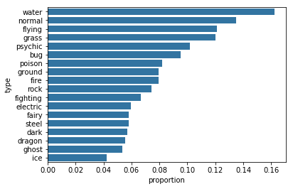
为者常成,行者常至
自由转载-非商用-非衍生-保持署名(创意共享3.0许可证)


