
Python:线性代数-矩阵-绘制向量 (五十)
向量 lab
在此 notebook 中,你将学习如何绘制二维向量和进行某些向量计算。
具体来说:
- 绘制二维向量
- 将二维向量与标量相乘并绘制结果
- 将两个向量相加并绘制结果
对于此 lab,我们将使用 python 软件包 NumPy 创建向量并计算向量运算。对于绘图部分,我们将使用 python 软件包 Matplotlib。
绘制二维向量
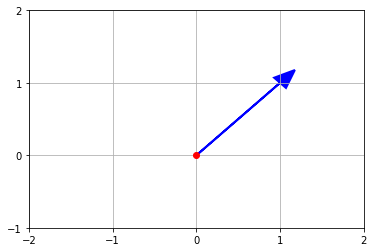
对于此部分,我们将绘制定义如下的向量 \(\vec{v}\)。
\(\hspace{1cm}\vec{v} = \begin{bmatrix} 1\ 1\end{bmatrix}\)
下面简要介绍了绘制向量 \(\vec{v}\) 的 Python 代码所包含的部分。
- 使用 import 方法使 NumPy 和 Matlibplot python 软件包可用。
- 定义向量 \(\vec{v}\)
- 使用 Matlibplot 绘制向量 \(\vec{v}\)
- 创建一个变量 ax 来表示图的坐标轴
- 使用 ax 和 plot 方法绘出原点 0,0(红点)
- 使用 ax 和 arrow 方法绘出向量 \(\vec{v}\):蓝色箭头,起点为 0,0
- 确定 x 轴的格式
- 使用 xlim 方法设置范围
- 使用 ax 和 set_xticks 方法设置主要刻度线
- 确定 y 轴的格式
- 使用 ylim 方法设置范围
- 使用 ax 和 set_yticks 方法设置主要刻度线
- 使用 grid 方法创建网格线
- 使用 show 方法显示图
# Import NumPy and Matplotlib
%matplotlib inline
import numpy as np
import matplotlib.pyplot as plt

# Define vector v
v = np.array([1,1])

# Plots vector v as blue arrow with red dot at origin (0,0) using Matplotlib

# Creates axes of plot referenced 'ax'
ax = plt.axes()

# Plots red dot at origin (0,0)
ax.plot(0,0,'or')

# Plots vector v as blue arrow starting at origin 0,0
ax.arrow(0, 0, *v, color='b', linewidth=2.0, head_width=0.20, head_length=0.25)

# Sets limit for plot for x-axis
plt.xlim(-2,2)

# Set major ticks for x-axis
major_xticks = np.arange(-2, 3)
ax.set_xticks(major_xticks)

# Sets limit for plot for y-axis
plt.ylim(-1, 2)

# Set major ticks for y-axis
major_yticks = np.arange(-1, 3)
ax.set_yticks(major_yticks)

# Creates gridlines for only major tick marks
plt.grid(b=True, which='major')

# Displays final plot
plt.show()
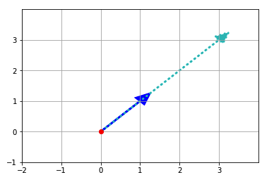
使用标量伸缩向量
对于此部分,我们将绘制将向量 \(\vec{v}\) 乘以标量 a 后的结果。标量 a 和向量 \(\vec{v}\) 的定义如下。
\(\hspace{1cm}a = 3 \)
\(\hspace{1cm}\vec{v} = \begin{bmatrix} 1\ 1\end{bmatrix}\)
TODO:将向量与标量相乘并绘制结果
对于此部分,你将创建向量 \(\vec{av}\),并在图中用青色虚线表示该向量。
-
在以下代码中使向量 \(\vec{v}\) 与标量 a 相乘(请参阅 TODO 1.:)。
-
在以下代码中使用 ax.arrow(...) 语句将向量 $\vec{av}$ 添加到图中(请参阅 *TODO 2.:)。 在 ax.arrow(...) 语句中添加 linestyle = 'dotted' 并将 color 设为 'c' ,使向量 \(\vec{av}\) 变成青色虚线向量。
# Define vector v
v = np.array([1,1])

# Define scalar a
a = 3

# TODO 1.: Define vector av - as vector v multiplied by scalar a
av = a * v

# Plots vector v as blue arrow with red dot at origin (0,0) using Matplotlib

# Creates axes of plot referenced 'ax'
ax = plt.axes()

# Plots red dot at origin (0,0)
ax.plot(0,0,'or')

# Plots vector v as blue arrow starting at origin 0,0
ax.arrow(0, 0, *v, color='b', linewidth=2.5, head_width=0.30, head_length=0.35)

# TODO 2.: Plot vector av as dotted (linestyle='dotted') vector of cyan color (color='c')
# using ax.arrow() statement above as template for the plot
ax.arrow(0, 0, *av, color='c', linewidth=2.5, head_width=0.30, head_length=0.35, linestyle='dotted')

# Sets limit for plot for x-axis
plt.xlim(-2, 4)

# Set major ticks for x-axis
major_xticks = np.arange(-2, 4)
ax.set_xticks(major_xticks)

# Sets limit for plot for y-axis
plt.ylim(-1, 4)

# Set major ticks for y-axis
major_yticks = np.arange(-1, 4)
ax.set_yticks(major_yticks)

# Creates gridlines for only major tick marks
plt.grid(b=True, which='major')

# Displays final plot
plt.show()
伸缩向量的解决方案视频
你可以在向量 lab解决方案部分找到解决方案视频。建议打开另一个浏览器窗口,以便在向量 lab Jupyter Notebook 和此 lab的解决方案视频之间轻松切换。
将两个向量相加
在此部分,我们将绘制将向量 \(\vec{w}\) 加到向量 \(\vec{v}\) 上的结果。向量 \(\vec{v}\) 和 \(\vec{w}\) 定义如下。
\(\hspace{1cm}\vec{v} = \begin{bmatrix} 1\ 1\end{bmatrix}\)
\(\hspace{1cm}\vec{w} = \begin{bmatrix} -2\ 2\end{bmatrix}\)
绘制两个向量
以下是显示从原点 (0,0) 开始的向量 \(\vec{v}\) 和 \(\vec{w}\) 的代码及图。
# Define vector v
v = np.array([1,1])

# Define vector w
w = np.array([-2,2])

# Plots vector v(blue arrow) and vector w(cyan arrow) with red dot at origin (0,0)
# using Matplotlib

# Creates axes of plot referenced 'ax'
ax = plt.axes()

# Plots red dot at origin (0,0)
ax.plot(0,0,'or')

# Plots vector v as blue arrow starting at origin 0,0
ax.arrow(0, 0, *v, color='b', linewidth=2.5, head_width=0.30, head_length=0.35)

# Plots vector w as cyan arrow starting at origin 0,0
ax.arrow(0, 0, *w, color='c', linewidth=2.5, head_width=0.30, head_length=0.35)

# Sets limit for plot for x-axis
plt.xlim(-3, 2)

# Set major ticks for x-axis
major_xticks = np.arange(-3, 2)
ax.set_xticks(major_xticks)

# Sets limit for plot for y-axis
plt.ylim(-1, 4)

# Set major ticks for y-axis
major_yticks = np.arange(-1, 4)
ax.set_yticks(major_yticks)

# Creates gridlines for only major tick marks
plt.grid(b=True, which='major')

# Displays final plot
plt.show()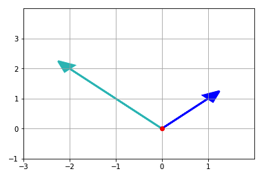
向量相加
我们在下图中显示了将向量 \(\vec{w}\) 加到向量 \(\vec{v}\) 上的过程。
绘制向量相加过程
以下是将向量 \(\vec{w}\) 加到向量 \(\vec{v}\) 上的代码和图。注意,当我们将向量 \(\vec{w}\) 加到向量 \(\vec{v}\) 上时,向量 \(\vec{w}\) 的原点现在变成 (1,1)。此外,我们在 _ax.arrow(...)_ 语句中添加了 _linestyle = 'dotted'_ 和 _color = 'c'_,使向量 \(\vec{w}\) 变成青色虚线向量。
# Define vector v
v = np.array([1,1])

# Define vector w
w = np.array([-2,2])

# Plot that graphically shows vector w(dotted cyan arrow) added to vector v(blue arrow)
# using Matplotlib

# Creates axes of plot referenced 'ax'
ax = plt.axes()

# Plots red dot at origin (0,0)
ax.plot(0,0,'or')

# Plots vector v as blue arrow starting at origin 0,0
ax.arrow(0, 0, *v, color='b', linewidth=2.5, head_width=0.30, head_length=0.35)

# Plots vector w as cyan arrow with origin defined by vector v
ax.arrow(v[0], v[1], *w, linestyle='dotted', color='c', linewidth=2.5,
         head_width=0.30, head_length=0.35)

# Sets limit for plot for x-axis
plt.xlim(-3, 2)

# Set major ticks for x-axis
major_xticks = np.arange(-3, 2)
ax.set_xticks(major_xticks)

# Sets limit for plot for y-axis
plt.ylim(-1, 4)

# Set major ticks for y-axis
major_yticks = np.arange(-1, 4)
ax.set_yticks(major_yticks)

# Creates gridlines for only major tick marks
plt.grid(b=True, which='major')

# Displays final plot
plt.show()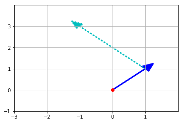
TODO:将两个向量相加并绘制结果
在此部分,你将创建向量 \(\vec{vw}\),然后在图中表示成更粗的黑色向量。
-
在以下代码中通过将向量 \(\vec{w}\) 加到向量 \(\vec{v}\) 上创建向量 \(\vec{vw}\)(请参阅 TODO 1.:)。
-
在以下代码中使用
_ax.arrow(...)_语句将向量 \(\vec{vw}\) 添加到图中(请参阅 *TODO 2.:)。在 ax.arrow(...) 语句中设置 linewidth = 3.5 和 color = 'k',使向量 $\vec{vw}$ 变成更粗的黑色向量。
# Define vector v
v = np.array([1,1])

# Define vector w
w = np.array([-2,2])

# TODO 1.: Define vector vw by adding vectors v and w
vw = v + w

# Plot that graphically shows vector vw (color='b') - which is the result of
# adding vector w(dotted cyan arrow) to vector v(blue arrow) using Matplotlib

# Creates axes of plot referenced 'ax'
ax = plt.axes()

# Plots red dot at origin (0,0)
ax.plot(0,0,'or')

# Plots vector v as blue arrow starting at origin 0,0
ax.arrow(0, 0, *v, color='b', linewidth=2.5, head_width=0.30, head_length=0.35)

# Plots vector w as cyan arrow with origin defined by vector v
ax.arrow(v[0], v[1], *w, linestyle='dotted', color='c', linewidth=2.5,
         head_width=0.30, head_length=0.35)

# TODO 2.: Plot vector vw as black arrow (color='k') with 3.5 linewidth (linewidth=3.5)
# starting vector v's origin (0,0)
ax.arrow(0, 0, *vw, linestyle='dotted', color='k', linewidth=3.5,
         head_width=0.30, head_length=0.35)

# Sets limit for plot for x-axis
plt.xlim(-3, 2)

# Set major ticks for x-axis
major_xticks = np.arange(-3, 2)
ax.set_xticks(major_xticks)

# Sets limit for plot for y-axis
plt.ylim(-1, 4)

# Set major ticks for y-axis
major_yticks = np.arange(-1, 4)
ax.set_yticks(major_yticks)

# Creates gridlines for only major tick marks
plt.grid(b=True, which='major')

# Displays final plot
plt.show()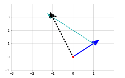
为者常成,行者常至
自由转载-非商用-非衍生-保持署名(创意共享3.0许可证)


